

Worth a thousand words…
Source: The Economist
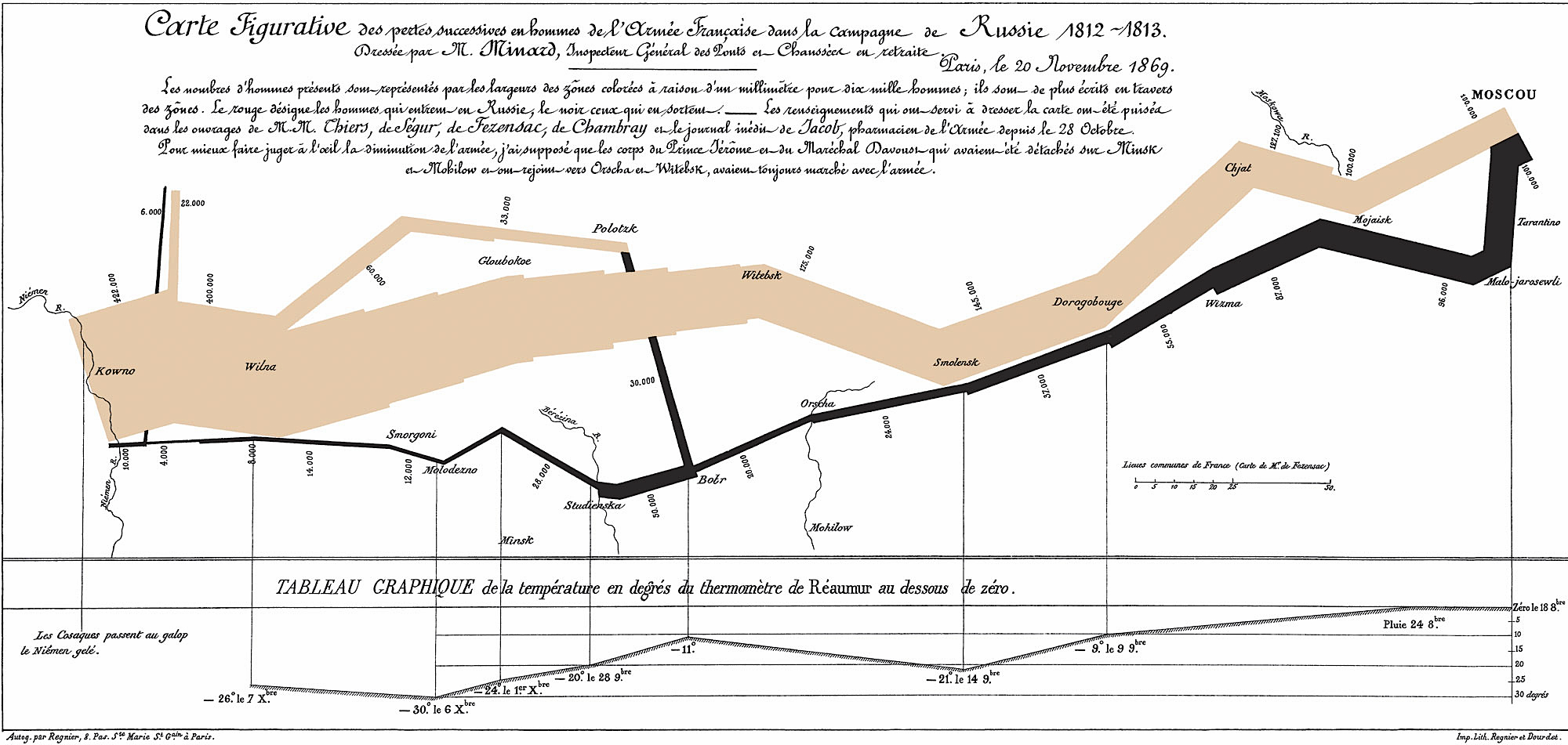
“A good graphic can tell a story, bring a lump to the throat, even change policies…” read the opening lines of a feature piece in the December 19th edition of The Economist. Cited by author Edward Tufte as “the best statistical graphic ever drawn,” the chart above also tells the story of a war: Napoleon’s Russian campaign of 1812. “It was drawn half a century afterwards by Charles Joseph Minard, a French civil engineer who worked on dams, canals and bridges. He was 80 years old and long retired when, in 1861, he called on the innovative techniques he had invented for the purpose of displaying flows of people, in order to tell the tragic tale in a single image.”
“Minard’s chart shows six types of information: geography, time, temperature, the course and direction of the army’s movement, and the number of troops remaining. The widths of the gold (outward) and black (returning) paths represent the size of the force, one millimetre to 10,000 men. Geographical features and major battles are marked and named, and plummeting temperatures on the return journey are shown along the bottom.”
“The chart tells the dreadful story with painful clarity: in 1812, the Grand Army set out from Poland with a force of 422,000; only 100,000 reached Moscow; and only 10,000 returned. The detail and understatement with which such horrifying loss is represented combine to bring a lump to the throat. As men tried, and mostly failed, to cross the Bérézina river under heavy attack, the width of the black line halves: another 20,000 or so gone. The French now use the expression “C’est la Bérézina” to describe a total disaster.”
“In 1871, the year after Minard died, his obituarist cited particularly his graphical innovations: ‘For the dry and complicated columns of statistical data, of which the analysis and the discussion always require a great sustained mental effort, he had substituted images mathematically proportioned, that the first glance takes in and knows without fatigue, and which manifest immediately the natural consequences or the comparisons unforeseen.’ The chart shown here is singled out for special mention: it “inspires bitter reflections on the cost to humanity of the madnesses of conquerors and the merciless thirst of military glory.”
Read the full The Economist piece online here. Download a high resolution JPG of the Minard Map (568 KB) here.