
Newberg, Oregon (USA)
Darryl Brown is the designer of Geez magazine, as well as a talented image maker (illustration and photography). In his words… “Unhappy with working for businesses I did not feel good about supporting, I recently quit a good design job to work in higher education (he’s now the art director at George Fox University). I gave up some income, but also traded a two-hour (round-trip) commute for a short bike ride to work every morning. More importantly, I do work I believe in.” Check out Darryl’s new blog for inspiring examples of visual creativity—here.

Thanks to Aiden Enns for the heads-up (Aiden credits me with “introducing him to the concept of wabi sabi” some years ago, for which Darryl offers this definition here: “Wabi sabi is an intuitive appreciation of transient beauty in the physical world that reflects the irreversible flow of life in the spiritual world. It is an understated beauty that exists in the modest, rustic, imperfect, or even decayed, an aesthetic sensibility that finds a melancholic beauty in the impermanence of all things.”
All images © Darryl Brown: R is for rust; Baseball ll, blog header from darryldesigns.


From a great collection of design and architecture book covers compiled by Joe Kral on flickr here (thanks Jon Whipple)… many of which we also have in our library at Circle.


Buenos Aires, Argentina
I heard today from the Argentinian stencil-artist who created these great pieces—he’s also a talented book designer and artist working in various media (and he wishes to remain anonymous because, as he puts it, “…stenciling is illegal in my country.”) I’ve shown his work before here, and you can see more on his blog here.

San Francisco, California
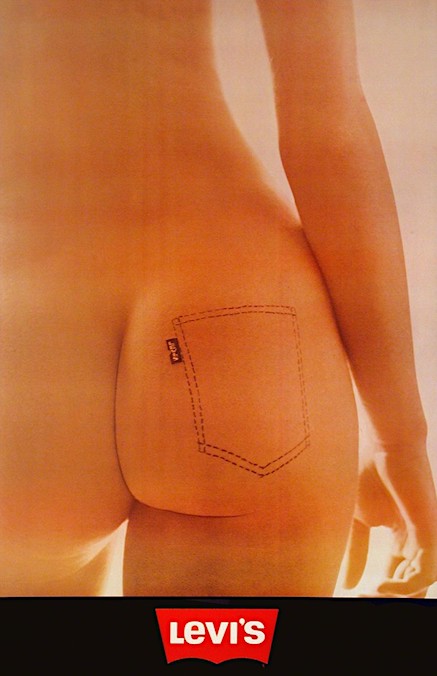
On this day in 1873, clothing manufacturer Levi Strauss and tailor Jacob Davis were granted a patent for using copper rivets to strengthen the pockets of denim overalls, paving the way for their business Levi Strauss & Co. to start manufacturing their first line of blue jeans.
In 1971, while art director at Young & Rubicam International in Brussels, Antwerp-born designer Van Bladel created this directly clever, cheeky, succinct poster-statement for the European market… stating that “slipping into a pair of Levis was as good as slithering into a very tight second skin.” Across the pond, the Levi’s poster featuring the (now) famous bare-butt with the Levis pocket stitching painted on was aborted, deemed unacceptable for the (more puritanical) US market at the time.


Winnipeg, Canada
I’m obviously not the only one who enjoys Russian posters… and though I’m drawn to the stark pictorial modernism many of these works exemplified, I also relate to them on a historical level (my father was born in Russia in 1920 amidst the turmoil of the Bolshevik revolution). El Lissitzky is one of my favorite Constructivists (I posted about a poster of his in my collection for which I found some interesting background last month). See more Soviet-era and Russian posters here, and here.
Images: ‘Help!’ by was designed by Dmitri Stakhievich Moor (aka Orlov, 1883-1946) during the drought and famine of 1921 (this dramatic poster has graced our washroom at Circle for nearly two decades); ‘Freed Woman! Build Socialism!’ was designed in 1926 by Adolf Strakhov (1896-1979).


Melbourne, Australia
Indigo, an international programme that provides a platform for Indigenous design was launched last night (today) in Melbourne by Icograda, the world body for professional communication design, in partnership with Australia’s National Design Centre. Indigo offers opportunities for local and Indigenous designers across the globe—as designers work within a global context seemingly without borders, Indigo provides a platform for evolving creative expressions that shape the formation of national cultural identities.
Indigo is a project that asks: What is Indigenous design? To address this, it has set up a network of designers and a series of projects that explore its meaning and interpretation throughout the world. The notion of local design is frequently contested, hard won and often indeterminate. It includes themes of colonisation, migration, politics, language, history, identity and conditions such as the economy and natural resources.
“Indigo seeks to understand what makes design distinctive to its home, the connections to the place where it is made and for whom it is made,” said Kathy Demos, Director of the National Design Centre. “Indigo is a demonstration of the IDA’s (International Design Alliance) commitment to fostering and promoting cultural diversity in today’s globalised society,” said Don Ryun Chang, President of Icograda and IDA Lead Chair.
I was delighted to see that background imagery for the Indigo website incorporates works from ‘Mix06 AUSA: Migrant Indigenous eXchange’ created by my students at the University of Hartford, USA and Monash University in Melbourne, AUS (Russell Kennedy and I introduced this pilot project in 2006 as an exploration of the relationship between Indigenous and non-Indigenous culture within the context of national identity). ‘Mix08: Sustainability is old news’ (the latest poster project announced by Indigo) invites design students around the world to create discourse and foster collaboration between Indigenous and non-Indigenous participants.


Kyoto, Japan
If you’re into visual illusion and optical phenomena, you’ll want to see the work of Akiyoshi Kitaoka, a Professor in the Department of Psychology at Ritsumeikan University, Kyoto. But be warned… his site “contains some works of ‘anomalous motion illusion,’ which might make sensitive observers dizzy or sick (e.g. epileptic seizures, which can happen if the brain can’t handle conflicting information from your two eyes). Should you feel dizzy, you had better leave immediately….” A wealth of useful information appears on or is linked to his site (granted, website design is not his strength)— here.
No, these are not moving images… your mind creates the illusion of motion.

Bern, Switzerland
The Union Internationale des Associations d’Alpinisme (UIAA) has developed proposed international standards for “guidebooks which are easy to use even for someone with little knowledge of the local language.” You can access examples of icons for use in your topos here, and a table showing the relationship between the UIAA scale of difficulty for climbs and local scales (which vary around the world), here.
A useful Climbing Dictionary is offered by rockclimbing.com here.
Climb on…


From the past…
Last night I stumbled across a great bunch of classic, mid-20th Century illustrations (by hundreds of different illustrators) on flickr… see the image sets sorted by illustrator here, and by subject here. Great reference, and a nostalgic window into the past… enjoy.


London, U.K.
No commentary needed—the man’s formidable talent just keeps on flowing… see more of his work online here.


