Robert L. Peters

11 January 2008

Sir Edmund Hillary…

hillary_nz5.jpg

Auckland, New Zealand

Sir Edmund Hillary, the unassuming beekeeper who (together with Sherpa Tensing Norgay) was the first to successfully climb Mount Everest, passed on yesterday. Though he considered himself a simple man (“Adventuring can be for the ordinary person with ordinary qualities, such as I regard myself,” he stated in a 1975 interview) he was known for his unbounded enthusiasm for life and adventure, his decades-long campaign to develop schools and health clinics in Nepal, and his role as an ardent conservationist. Revered by Kiwis, Prime Minister Helen Clark had this to say: “Sir Ed described himself as an average New Zealander with modest abilities. In reality, he was a colossus… an heroic figure who not only ‘knocked off’ Everest, but lived a life of determination, humility, and generosity… this legendary mountaineer, adventurer, and philanthropist is the best-known New Zealander ever to have lived.”

Climb on, Sir Edmund…

Hillary and Tensing Norgay summited Mount Everest, the highest point on earth, on 29 May 1953. He remains the only non-political person outside of Britain to have ever been honoured as a member of Britain’s Order of the Garter (bestowed by the Queen on just 24 knights and ladies living worldwide at any time) and was the first foreign national to ever be conferred with honourary citizenship by Nepal. Hillary has also appeared on the New Zealand $5 banknote since 1992—the only living Kiwi to ever do so.


10 January 2008

Worth a thousand words…

minardmap_sm.jpg

Source: The Economist

“A good graphic can tell a story, bring a lump to the throat, even change policies…” read the opening lines of a feature piece in the December 19th edition of The Economist. Cited by author Edward Tufte as “the best statistical graphic ever drawn,” the chart above also tells the story of a war: Napoleon’s Russian campaign of 1812. “It was drawn half a century afterwards by Charles Joseph Minard, a French civil engineer who worked on dams, canals and bridges. He was 80 years old and long retired when, in 1861, he called on the innovative techniques he had invented for the purpose of displaying flows of people, in order to tell the tragic tale in a single image.”

“Minard’s chart shows six types of information: geography, time, temperature, the course and direction of the army’s movement, and the number of troops remaining. The widths of the gold (outward) and black (returning) paths represent the size of the force, one millimetre to 10,000 men. Geographical features and major battles are marked and named, and plummeting temperatures on the return journey are shown along the bottom.”

“The chart tells the dreadful story with painful clarity: in 1812, the Grand Army set out from Poland with a force of 422,000; only 100,000 reached Moscow; and only 10,000 returned. The detail and understatement with which such horrifying loss is represented combine to bring a lump to the throat. As men tried, and mostly failed, to cross the Bérézina river under heavy attack, the width of the black line halves: another 20,000 or so gone. The French now use the expression “C’est la Bérézina” to describe a total disaster.”

“In 1871, the year after Minard died, his obituarist cited particularly his graphical innovations: ‘For the dry and complicated columns of statistical data, of which the analysis and the discussion always require a great sustained mental effort, he had substituted images mathematically proportioned, that the first glance takes in and knows without fatigue, and which manifest immediately the natural consequences or the comparisons unforeseen.’ The chart shown here is singled out for special mention: it “inspires bitter reflections on the cost to humanity of the madnesses of conquerors and the merciless thirst of military glory.”

Read the full The Economist piece online here. Download a high resolution JPG of the Minard Map (568 KB) here.


8 January 2008

i love typography

ilt_metaserif.jpg

Kagawa, Japan 日本香川県

Check out this great website on all things typographical… i love typography is a fine online resource created by John T. Boardley with the goal of “…bringing the subject of Typography to the masses… (and to) make people more aware of the typography that is around them.” Find lots of content and links for typophiles and neophytes alike here.

The graphic shown above features the recently-released Meta Serif by New Zealander Kris Sowersby of KLIM (www.klim.co.nz).


2 December 2007

PostSecret

hug.jpg

Winnipeg, Canada

An interesting collection of postcards are currently on exhibit at the Winnipeg Art Gallery, part of the body of work entitled PostSecret. PostSecret is an ongoing community art project where people mail in their secrets anonymously on one side of a homemade postcard—since 2004, people all over the world have had their most excruciating secrets appear anonymously on the popular Internet website Postsecret.com. Started as a communnity art project by Maryland-based Frank Warren, Postsecret.com has won several awards and attracts a reported million hits a week. To date, Warren has been mailed more than 170,000 secret-bearing postcards in a mind-bending array of creatively designed shapes, sizes and styles.

View an online selection here.


25 November 2007

Banksy hits the Big Apple…

hunters.jpg

balloongirl_alwayshope.jpg

haveaniceday.jpg

New York, New York

A show of works by the ubiquitous Banksy, anarchist artist extraordinaire (aka “the invisible man of graffiti art”) is scheduled to open at the Vanina Holasek Gallery in New York on 2 December… no doubt to be accompanied by impromptu creative iterations around the city. I’ve admired Banksy’s work for years, particularly with respect to his evocative anti-war, anti-capitalist, and pro-freedom statements.

A “best and brightest” piece in Esquire describes him as: “A phantom with a stencil and a can of spray paint, maybe the premier ‘Guerrilla Street Artist’ in the world, Banksy is almost impossible to find, but his work is everywhere. And he makes people very, very happy.”

Read more about Banksy here; see more of Banksy’s art here.


15 October 2007

Geez…

geez7.jpg

Winnipeg, Canada

I’ve just agreed to formally serve as a member of Geez magazine’s editorial advisory group (I’ve supported Geez unofficially since it’s start two years ago). If you’re interested in “…a place for wannabe contemplatives, front-line world-changers and restless cranks…”and feel that it’s time to “…untangle the narrative of faith from the fundamentalists, pious self-helpers and religio-profiteers…” then Geez may be for you.


10 October 2007

Left brain or right brain?

0569329700.gif

Do you see this dancer spinning clockwise, or counter-clockwise? If clockwise, you tend to use more of the right side of your brain. If counter-clockwise, you tend to use more of the left side (like the majority of people). Most designers travel easily from left to right and back… in fact, it’s this (relatively) unique disposition and ability that helps us guide our (mostly) left-brain clients to creative solutions while maintaining affinity with our (often) right-brain artist kin.

At Circle, we consciously practice “whole-brain thinking” by combining left-brain traits (analytical, logical, functional, focused, strategic) with right-brain traits (creative, intuitive, perceptive, passionate, tactical).

(Image source: The Courier Mail, Australia [thanks to Guy Schockaert])


26 July 2006

IDENTITA

identita.jpgidentita_2

Brno, Czech Republic

IDENTITA, the 34th exhibition of the Brno Biennale Association (BBA), opened today at Gallery HaDivadlo in Brno. This simple exhibition displays 450 faxable black-and-white submissions (created in A4 size) on the theme of “identity” by 240 invited artists from 40 different countries.

This is my submission… (a compilation of historic lithographic imagery was pressed into service).


2 May 2006

Cuba Si!

ca_cubache_r.jpg

Menlo Park, California

The May/June 2006 (#344) issue of Communication Arts magazine features an in-depth article entitled “Cuba Si! Life and design on the embargoed archipelago” written by Circle’s founder and principal, Robert L. Peters. The piece explores Cuba’s cultural and political realities in relation to visual communication, and is accompanied by a selection of graphic design spanning the 47-year span since the Cuban Revolution (many works never before seen outside of Cuba).

Peters has visited Cuba several times in recent years (as co-organizer and chair of the 2001 Havana Design Week held in the Che Guevara Memorial Hall [in conjunction with his board role with the International Council of Graphic Design Associations (Icograda)], and several subsequent visits re: design advocacy and preparation for the Icograda World Design Congress to be held in October 2007). In this regard he worked closely with professional Cuban colleagues from the PROGRÁFICA Committee in preparing the feature article, drawing on numerous studio visits as well as one-on-one interviews with designers working both within state organizations and independently.

Peters has been contributing articles to Communication Arts magazine since 1995 and has previously written for CA on design and design events in Russia, Portugal, Uruguay, Australia, Korea, Japan, Brazil, and China. Copies of CA issue #344 are available at book stores and major news outlets around the world and may be purchased online from the Communication Arts website.

Read or download a PDF-version of the “Cuba Si!” feature article here (3.6 MB).

cuba_posters_r.jpg


13 April 2006

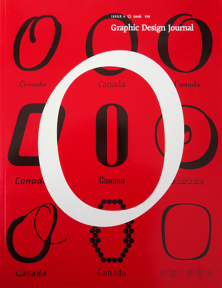
Graphic Design Journal… Issue 6 published.

GDC_Journal6_cover

Ottawa, Ontario

Issue 6 of the Graphic Design Journal published by the Society of Graphic Designers of Canada (GDC) features Canadian type and typographers. Edited by Circle’s Robert L. Peters, this issue includes articles by Rod McDonald, Nick Shinn, Walter Jungkind, Val Fullard, Richard Hunt and Matt Warburton, as well as Robert Bringhurst book reviews by Circle’s Susan McWatt Fitzgerald. Designed by Susan McWatt FitzGerald, the issue features a “Big O” cover designed by Zab (E. A. Hobart) with fly leaf illustration (An Orgy of Reading, detail below) by Marian Bantjes. In addition to the 18 Canadian fonts featured on the covers, the issue features Cartier Book Regular, Brown, Goodchild, Usherwood, Richler, and Mambo.

The Journal’s purpose is to provide a forum to encourage dialogue, to promote excellence in design and visual communication, and to help record the history and development of graphic design in Canada. Issue 6 is available through the GDC for $20. For more information about GDC and its variety of publications, visit the Society’s website.

Bantjes_orgy


« Previous PageNext Page »

© 2002-