

Shenzhen, China
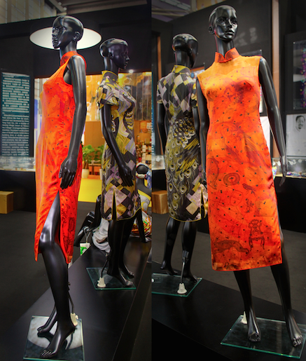
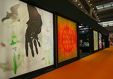
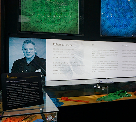
One of 2014’s highlights for me was to participate in The Look of Silk, (The First Session of Cross Strait Silk Culture and Creativity Forum and International Silk Creative Design Expo) sponsored by China Tong Yuan Co., Ltd., Shenzhen China Silk Park, and the Taiwan Cultural and Creative Industry Association.
As one of “eight internationally renowned designers” I was invited to design a pattern for silk scarves, participate in the 5-day event in Shenzhen, and to give a keynote address. A design team from Taiwan was commissioned to develop 80 different silk products using our designs, “creating a systematically multicultural design integrating multiple aspects.”
The Look of Silk plans to “keep alive the spirit of traditional Chinese culture and the international role played by silk in the past, while creating a brand image and market orientation for Chinese silk” by means of innovative creative activities.
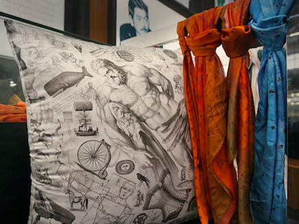
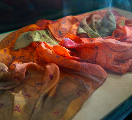
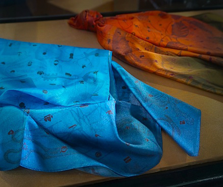
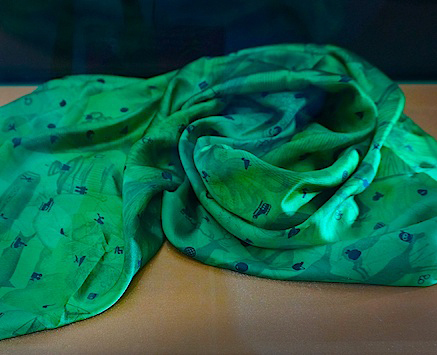
I recently received images from the organizers of my silk design applied to various products (from bed linens to ties, cushions, padded laptop cases, and other fashion accessories). Shown above is a small sampling… my original design was in oranges and reds, but the product design team decided to also iterate it in blue and green.
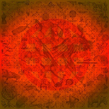
Click on the image below or here for a larger view of my silk pattern design (135mm x 135mm) entitled Occidental Habitué. Details of the design can be viewed at my original blog post, here.

Occidental Habitué
Thousands of icons, images, and visual impressions cross our consciousness daily, weaving rich cultural narratives and imbuing meaningful memories. As travellers, émigrés, and nomads in a shrinking world we wrap ourselves in layers of sensuous, intertwined experience.
My concept involves the creation of an intentionally layered, quirky, and semi-random collage, providing unexpected juxtapositions that draw in the viewer and then reward curiosity with serendipitous surprises of simultaneity. Ancient meets modern, complex collides with simple, small bests large.
Luminous color acts as a background for layered, multidirectional, copyright-free imagery from earlier eras — visual ephemera, linear diagrams, Victorian etchings, old prints, ornaments, printers’ spot illustrations, ad cuts, and clip art — from ancient cave paintings to art deco elements, from flora and fauna to whimsical human inventions.
As if floating above this nuanced visual composition, a repeating directional diamond pattern of contemporary symbols and info-graphic icons (from The Noun Project, an online “visual language” resource of icons created by a global community) lends added dimension, with icons varying in color in a top-to-bottom gradation, complementary to the hue of the background.
A symbol of the globe glows in the fabric’s center.
© 2014 Robert L. Peters


