

Tehran, Iran
An exhibition of graphic works by the great Finnish designer Kari Piippo is currently on display at vitrinrooz.com. I had the pleasure of spending a week with Kari in Moscow in 1994 (we were both jurors of the 2nd Golden Bee) and we crossed paths again a few years back in Taiwan (this time as jurors of the Taiwan International Poster Design Awards). Kari is one of our generation’s outstanding visual minimalists… conveying much with a real economy of means.

Hiroshima, Japan
For those involved in the peace movement around the globe, thoughts this week turn once again to the horrors of Monday, August 6, 1945—when at 08:15 the first nuclear weapon ever deployed on human beings (a bomb named Little Boy) was dropped on Hiroshima by the crew of the American B-29 bomber Enola Gay. Three days later, at 11:02 on Wednesday, August 9, Nagasaki was the target of the world’s first plutonium bomb (named Fat Man) dropped by the U.S. B-29 Superfortress Bockscar, flown by the crew of 393rd Squadron.
In 2005, I was one of 24 designers invited to contribute posters for Lest We Forget: Canadian Designers on War, an initiative marking the 60th anniversary of the bombing of Hiroshima and Nagasaki (I’ve posted on that previously, here). Michael Surtees attended that show opening at the Citadel Theatre in Edmonton—see his flickr photo gallery from the evening here.
Image above: a moving poster designed by the late great Yusaku Kamekura, considered by many to be the father of graphic design in Japan. The poster “depicts a cluster of multicoloured burning butterflies falling from the sky, caught in the flash of an atomic blast, their wings alight with hot red and orange flames burning like streaks of blood from their delicate wings—the beauty and grace of the image serves to undermine the horror and tragedy of war.” Hiroshima Appeals is a poster series that appears annually, initiated by Japan Graphic Designers Association for the Hiroshima International Cultural Foundation.

Takes one back to those halcyon days of yore, no? (from The Museum of Forgotten Art Supplies compiled by Lou Brooks… “where tools of the trade that have died or have just about died a slow slow death are cheerfully exhibited.”)
Thanks for the link, Nance!


Stuttgart, Germany
Heinz Edelmann, the multifaceted graphic designer and illustrator who created the comically hallucinogenic landscape of Pepperland as art director for the 1968 animated Beatles film “Yellow Submarine,” died on Tuesday of this week in Stuttgart, Germany. He was 75…. A highly successful advertising and editorial illustrator in Germany, England and the Netherlands, Mr. Edelmann was known for combining Impressionist and Expressionist sensibilities leavened with wit, humor and irony. He developed a distinct graphic style that influenced many artists in Europe and the United States…
Read the full tribute written by Steven Heller for The New York Times here. See some of Mr. Edelmann’s works on Milton Glaser’s Container List here and here.
Images: the mod-psychedelic look of the 1968 Beatles movie “Yellow Submarine;” posters for West Deutscher Rundfunk (radio) from 1982 and 1983.


Warsaw, Poland
Our friend, the incredibly talented illustrator Stasys Eidrigevičius, turns 60 this week. Best wishes, and keep up with the phenomenal work! (Experience some of Stasys’ remarkably empathetic illustrations and graphic creations here, here, and here).
Stasys currently has an exhibition (Stasys and POLITYKA—drawings for the magazine Polityka from 1986-9 as well as posters) on exhibit at the Koszalin Town Art Museum; from 25-26 July an instillation of his is showing at the ECHIGO-TSUMARI ART TRIENNAL; two days ago (17 July) his works went on display at the Toyama Poster Triennal; and on 3 August, his exhibition Wall of Silence opens in Warsaw the Muzeum Powstania. (Thanks to Rene Wanner for the news and exhibiton details).


Lisbon, Portugal
I’ve found myself (re)attracted to visual collage of late—and Cristiana Couceiro does it exceptionally well. Admittedly, form seems to trump meaning (or coherence) in much of her illustrative work(?)… but there’s a time and place for being obtuse, right? Enjoy more here.


Luxemburg, 04.07.2009 – 01.11.2009
Fabrica has been invited by the cultural space CarréRotondes in Luxemburg to present Colors of Money, an exhibition exploring the approaches, uses and understandings of money. Based on the 73rd issue of Colors Magazine (Money, winter 2007/2008), Colors of Money posits that “money is an illusion,” highlighting the myriad contradictions embodied in the all-embracing role money has come to play in modern society. Read more about the exhibition here.

Winnipeg, Canada
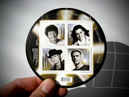
Circle’s latest Canadian Recording Artists stamps (that launched a week ago) have garnered a fair bit of early attention, and there’s been a steady stream of feedback from both near and far. Locally, I was interviewed on 3 July by Margaux Watt on the CBC radio afternoon show, and on 4 July the Winnipeg Free Press ran an article about the stamps’ design in the Business section (view a larger JPG of the article here or read the piece online here).
The Globe And Mail ran an in-depth story (online here), CTV gave the issue quite a bit of coverage as did Radio-Canada (highlighting that this is the first time that Canadians who perform in French are being lauded by Canada Post), and the stamps and related stories have appeared on numerous websites and blogs (including Bryan Adams’ website here) and philatelic collectors’ sites such as Stamp News International.
Canada Post and the featured artists all appear to be pleased. Stompin’ Tom says he’s “delighted, humbled and overwhelmed by the ‘stamp of approval;’” Édith Butler (whose great grandfather was a postmaster and who sent us photos of the stamp launch in Paquetville, NB—where her 92-year-old cousin was the first in line at the post office to buy a souvenir sheet) called the stamps “the greatest thing that ever happened to me;” a chuffed Bryan Adams responded “It is a wonderful honour to be amongst the great men and women who have graced our Canadian stamps… I am humbled by the recognition;” and Robert Charlebois stated: “I wish my parents would be alive to see this, because when I started 40 years ago, I never thought I would land on a stamp… I probably will send all my friends postcards with my own face on it, especially to my friends in Belgium and Switzerland—they’re going to faint, they won’t believe their eyes.”


Atlanta, Georgia
I stumbled across these (and many more) inspiring graphic assemblages by Mark Weaver here. There’s certainly something to be said about the power of juxtaposition…


