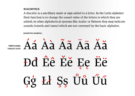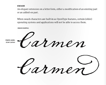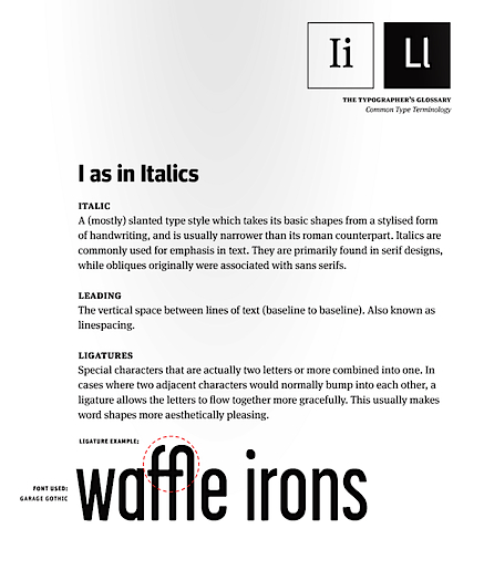


A FontShop publication on ISSUU, here.
Thanks to Erik Spiekermann for the link.


Rapperswil, Switzerland
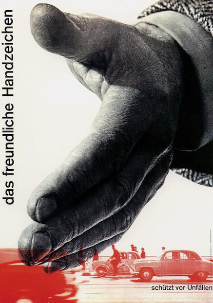
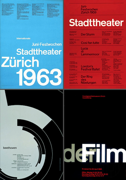
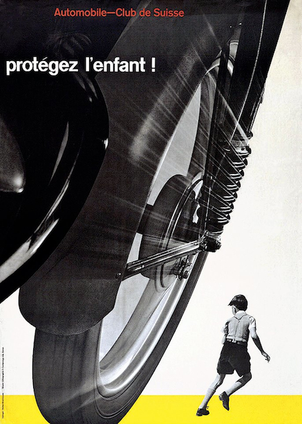
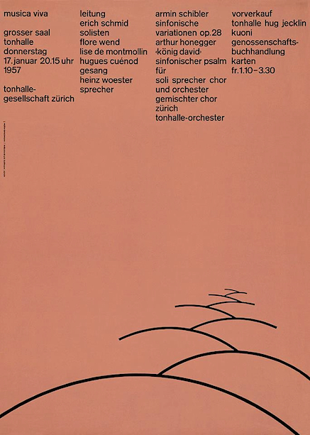
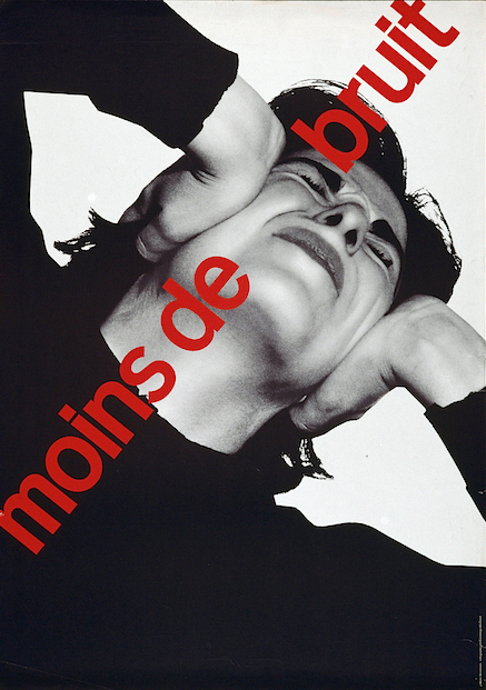
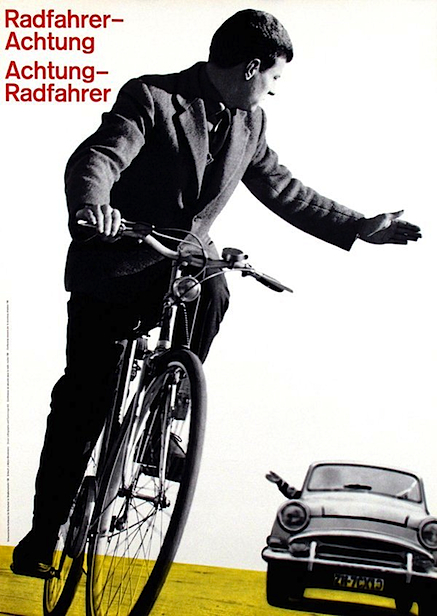
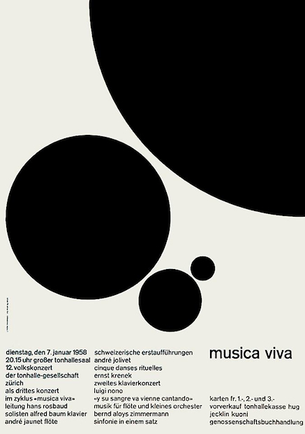
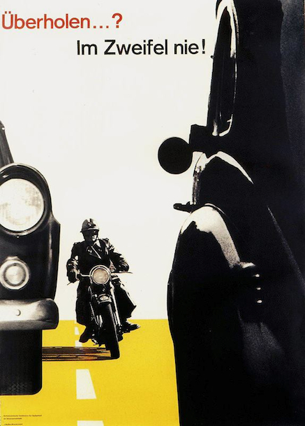
Among the Swiss graphic designers who so greatly shaped the direction of our profession in the last century, perhaps none was more influential than Josef Müller-Brockmann, (1914-1996).
Shown above are a selection of his posters.


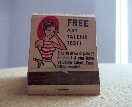
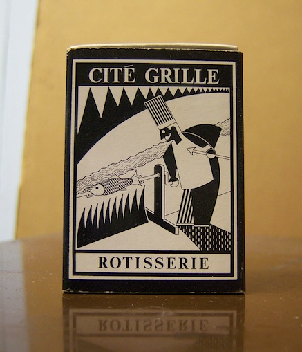
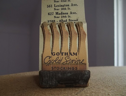
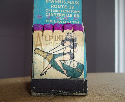
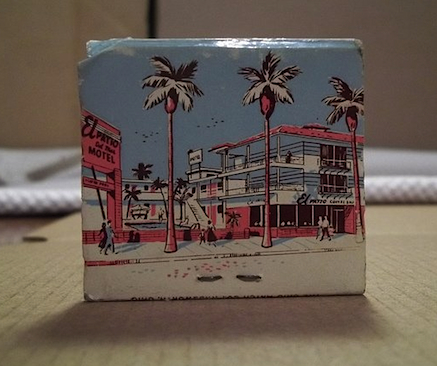
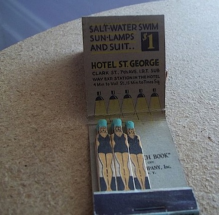
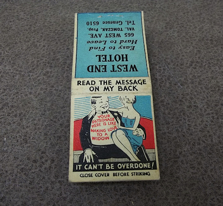
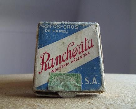
If you like vintage collectables and graphic ephemera, you can find thousands of matchbook photographs here…


New York, New York
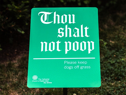
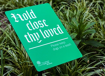
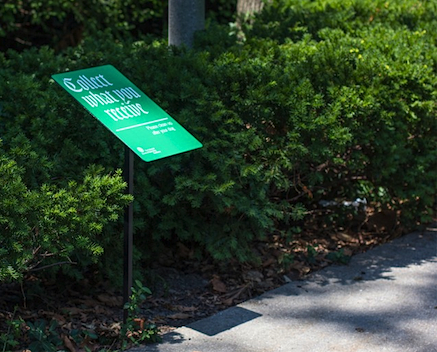
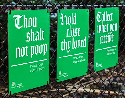
“The Cathedral of Saint John the Divine was facing a plague of pooches whose owners wouldn’t pick up after them, but instead of banning the beasts, the church elders turned to New York design firm Pentagram* for a scriptural solution… that would preach the values of respect, fellowship, and proper poop removal etiquette. Fine tuning the balance between sass and sacrilege was the key challenge… the designs were blessed by the church’s leadership and have become so popular that they’re considering enshrining them in a place of great honor — the gift shop.”
*Pentagram partner Michael Bierut had refreshed the church’s identity in 2009, creating a minimal system that leveraged a modernized blackletter font, bright colors, and cheeky copy to help spread the good word to jaded New Yorkers.
(source) Thanks to my colleague Adrian Shum for the link.


Boston, Massachusetts
Fonts in Use is a public online archive of typography, indexed by “industries, formats, and typefaces.” Its stated intent is to document and examine graphic design with the goal of improving typographic literacy and appreciation.
Show above is a tiny sampling of the thousands of examples (spanning many decades) one can view here.
(Thanks to J Ray for the link).


Zürich, Switzerland
Like most graphic designers, I love posters. Like many others, I’m also somewhat of a collector (stamps, books, publications, ephemera, 100s of posters)…
This week I had the chance to unroll and look at some 30 or so posters I have from the Kunstgewerbemuseum in Zürich, acquired during a visit there in 1986. Beautifully designed and printed (many are silk-screened), these large A0-sized pieces (841 mm x 1189 mm) are truly a joy to view.
Shown above is a small selection — enjoy.


Bridgeport, Connecticut
I’m always chuffed when I stumble across work by former students… nice wordplay and graphic iterations by Matt Hunsberger, who took part in a studio course I taught at the Hartford Art School (University of Hartford, Connecticut) back in 2006, when I was a recipient of the Georgette and Richard Koopman Distinguished Chair in the Visual Arts.
Rock on, Matt!


(source)
A first its kind, The Lost Type Co-Op is a pay-what-you-want type foundry.
Begun a little over two years ago by Riley Cran and Tyler Galpin, originally in a whirlwind 24 hour adventure to distribute a single typeface, Lost Type has blossomed into a full fledged foundry, distributing fonts from designers all over the world.
Users have the opportunity to pay whatever they like for a font (you can even type in ‘$0’ for a free download). 100% of funds from these sales go directly to the designers of the fonts, respectively — Lost Type takes no cut of sales, and holds no funds.
